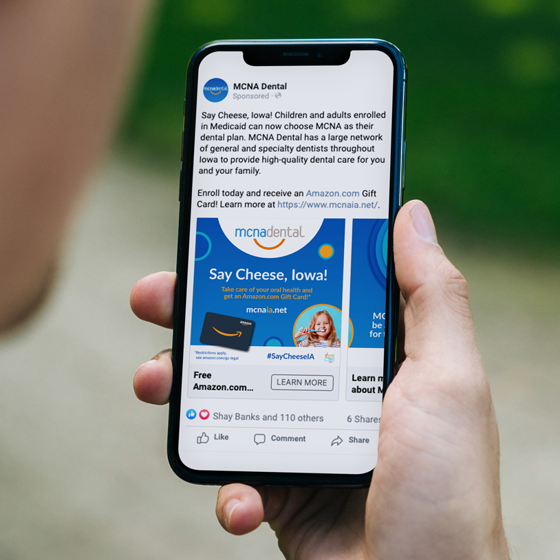
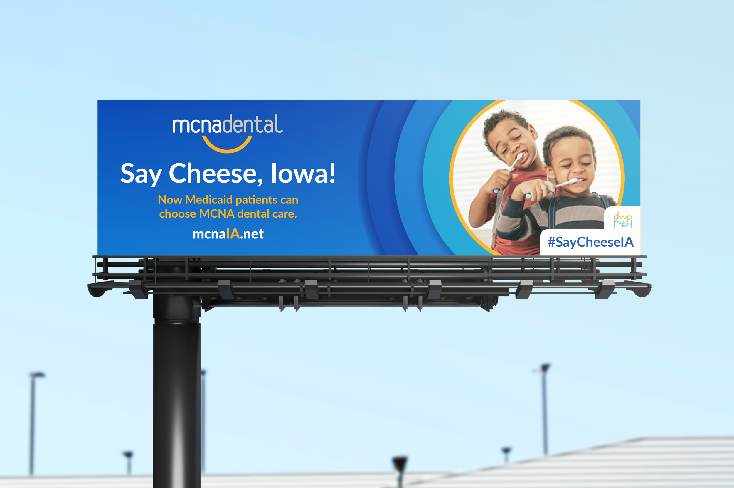
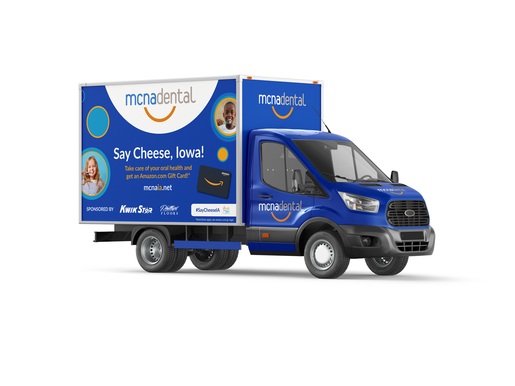
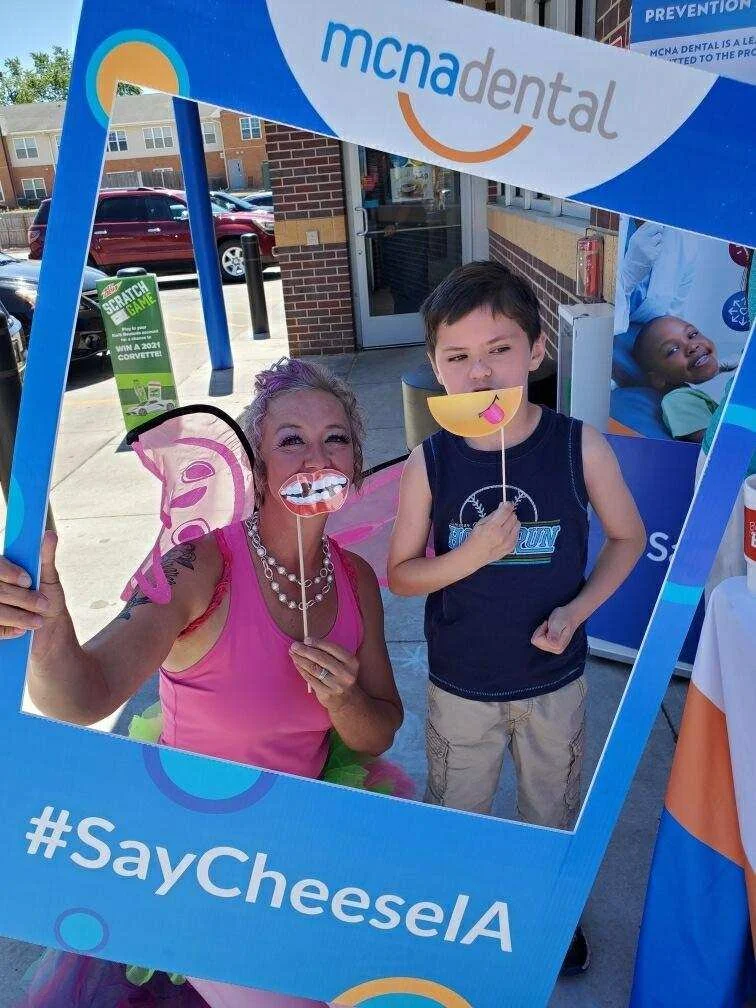
MCNA Dental needed an awareness campaign to launch its services in Iowa. The campaign #SayCheeseIA was created to familiarize Iowans with the brand. It was broadcasted across Iowa via digital ads and billboards, as well as via the MCNA Dental Smile Tour with 20+ stops throughout the state.
As the lead creative on the campaign, I worked with MCNA Dental and Amazon to ensure brand integrity was consistent throughout all collateral.
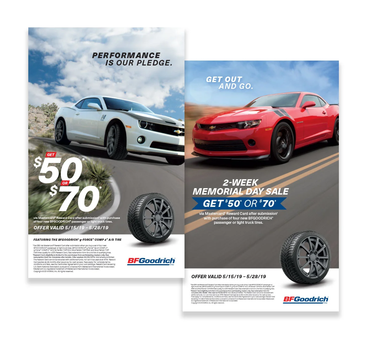
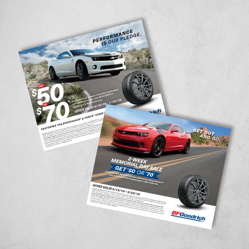
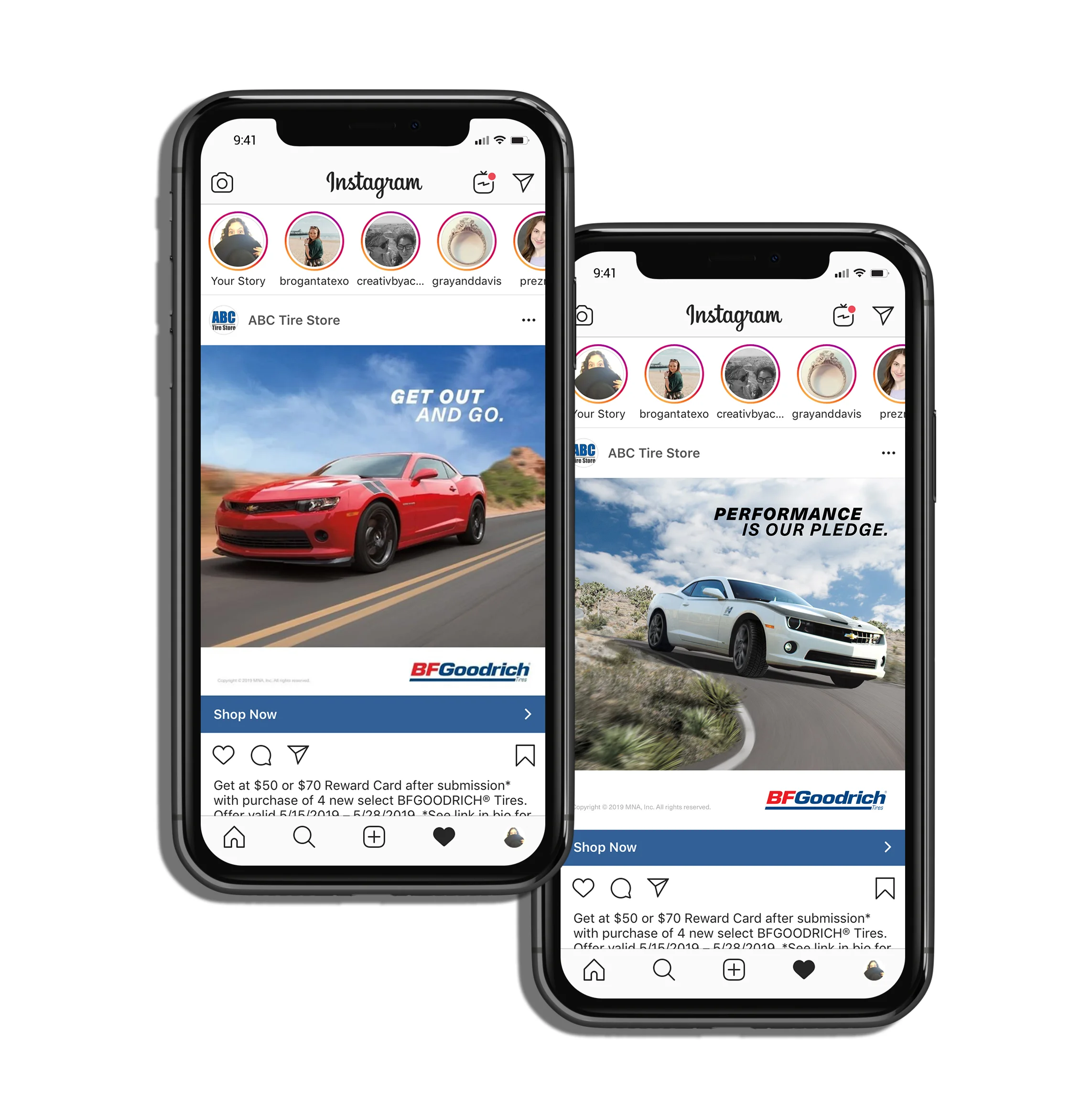
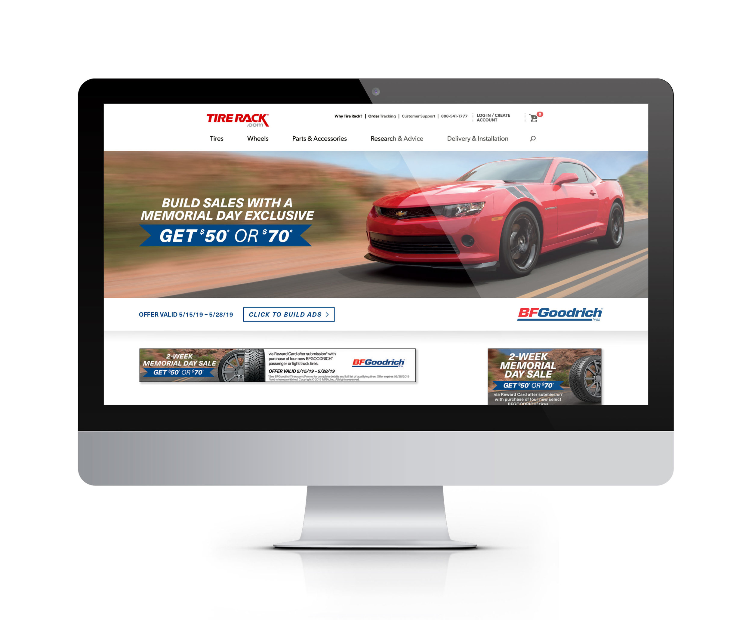
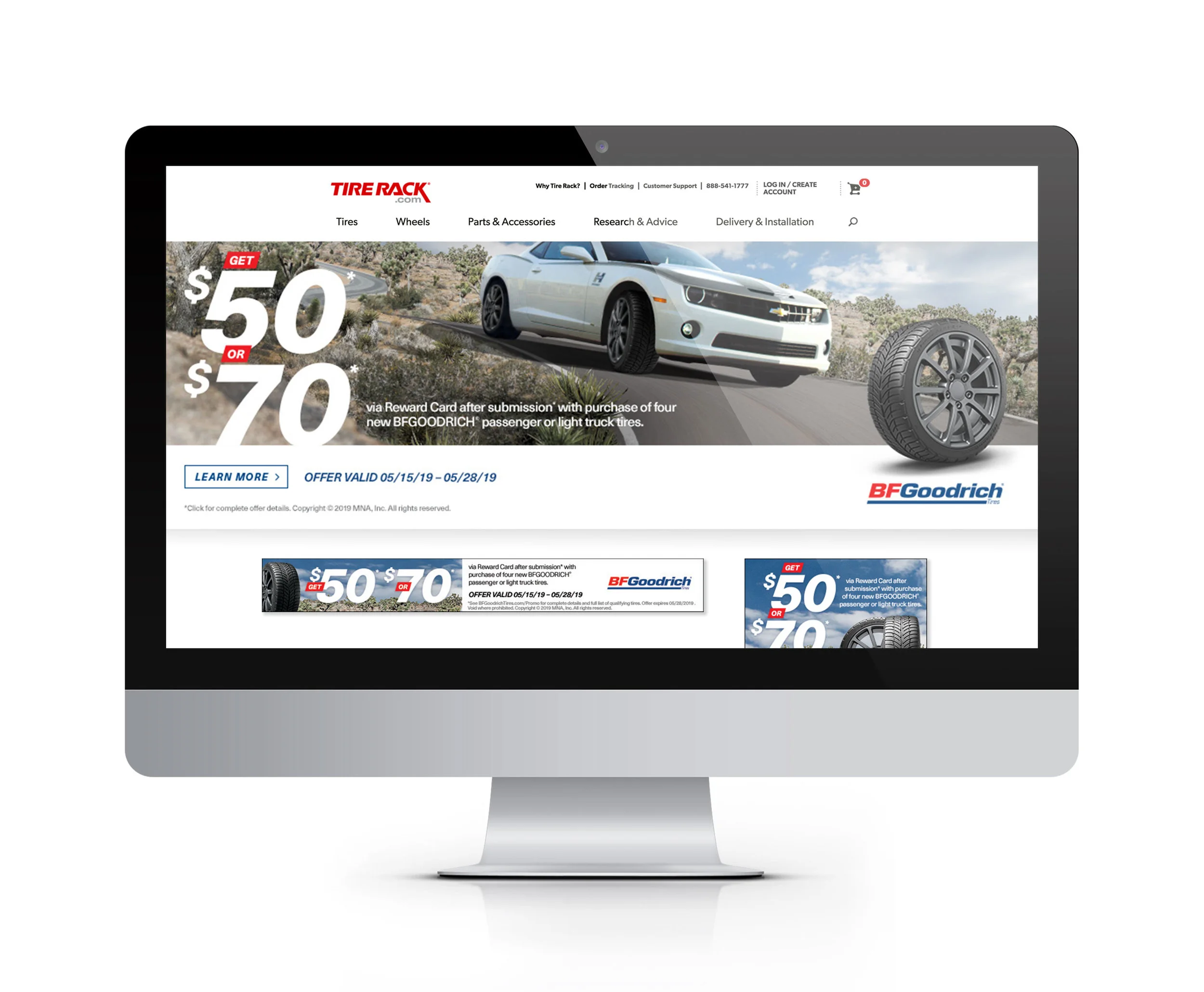
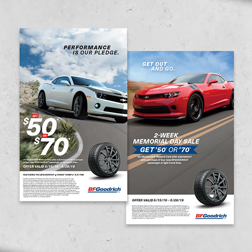
I was tasked to come up with two different looks for the BFGoodrich Memorial Day promotion. Both were used for print and digital assets utilized by independent tire dealers. These images were specially made for this promotion – emphasizing the start of summer and the federal holiday. Both concepts were used for newspaper, social media, video and in-store assets. I directed both designers and art directors in layout of all promotional materials.
Creative Director | Alesha Burgraff
Art Director | Christopher Griggers
Designer | Jenna Boures
Designer | Allie Reed
Copywriter | Kristin Kelly
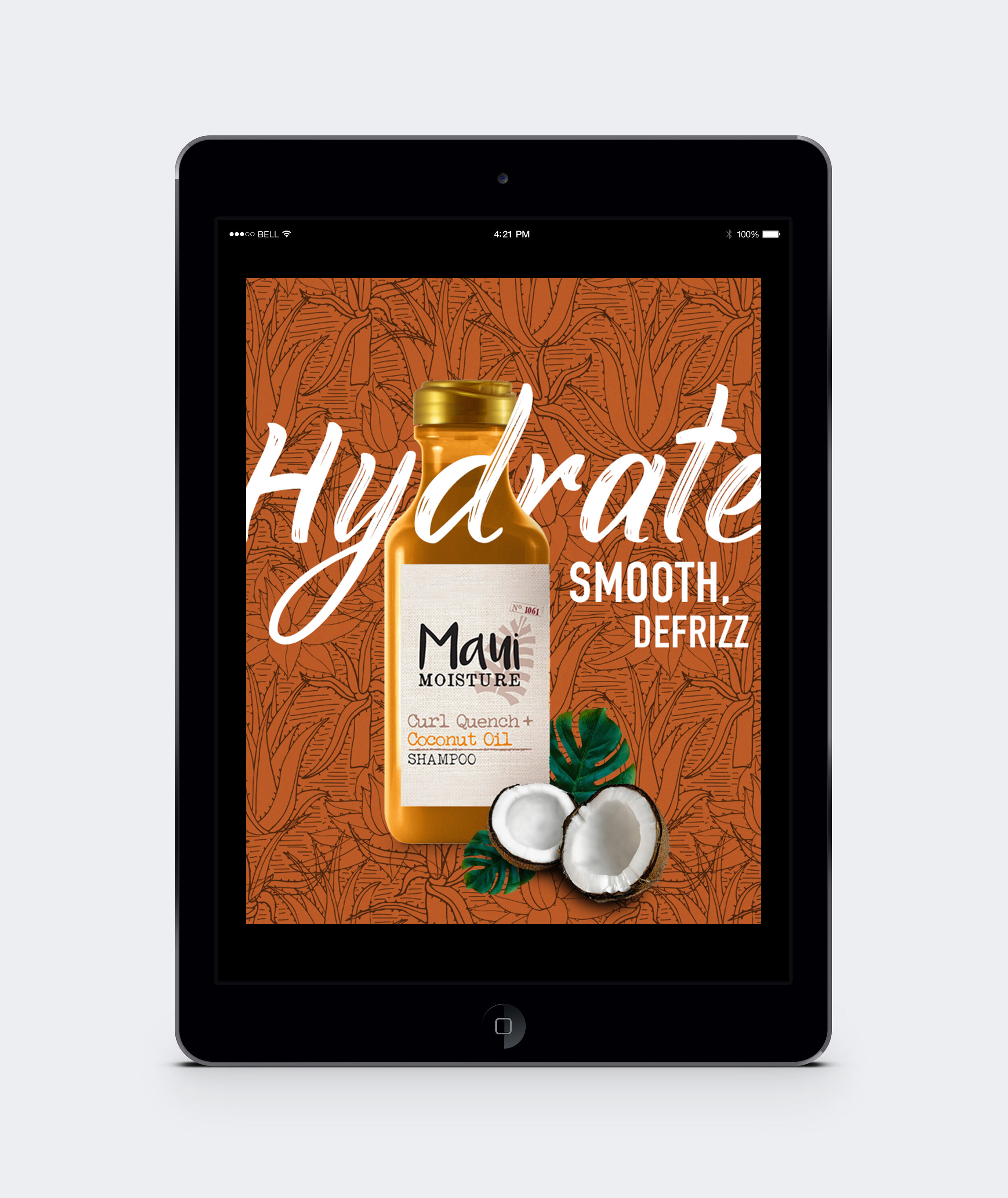
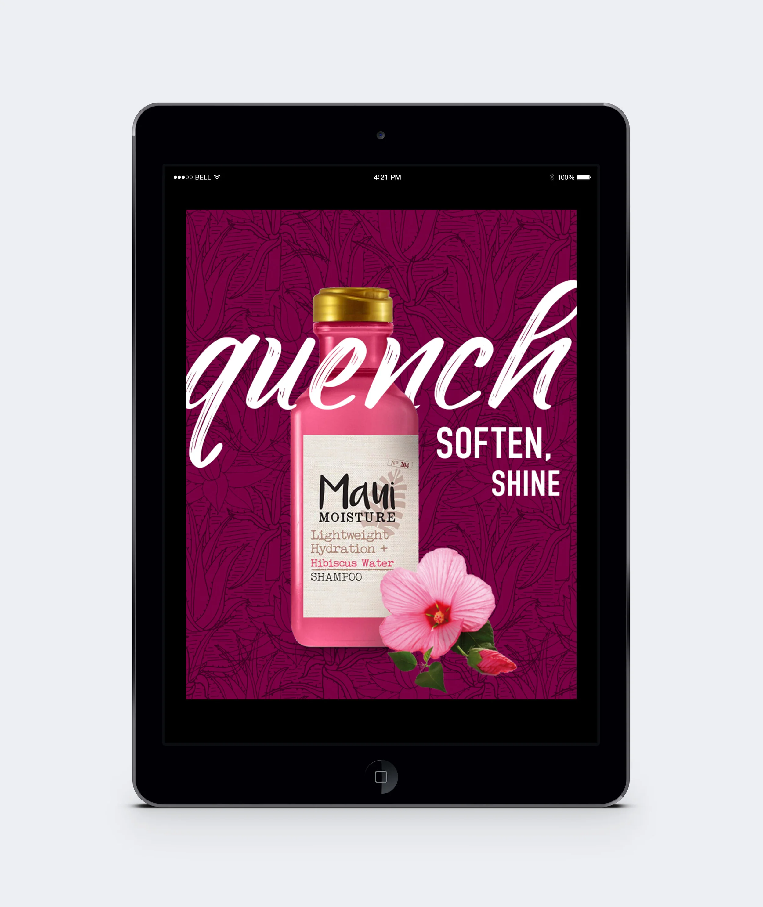
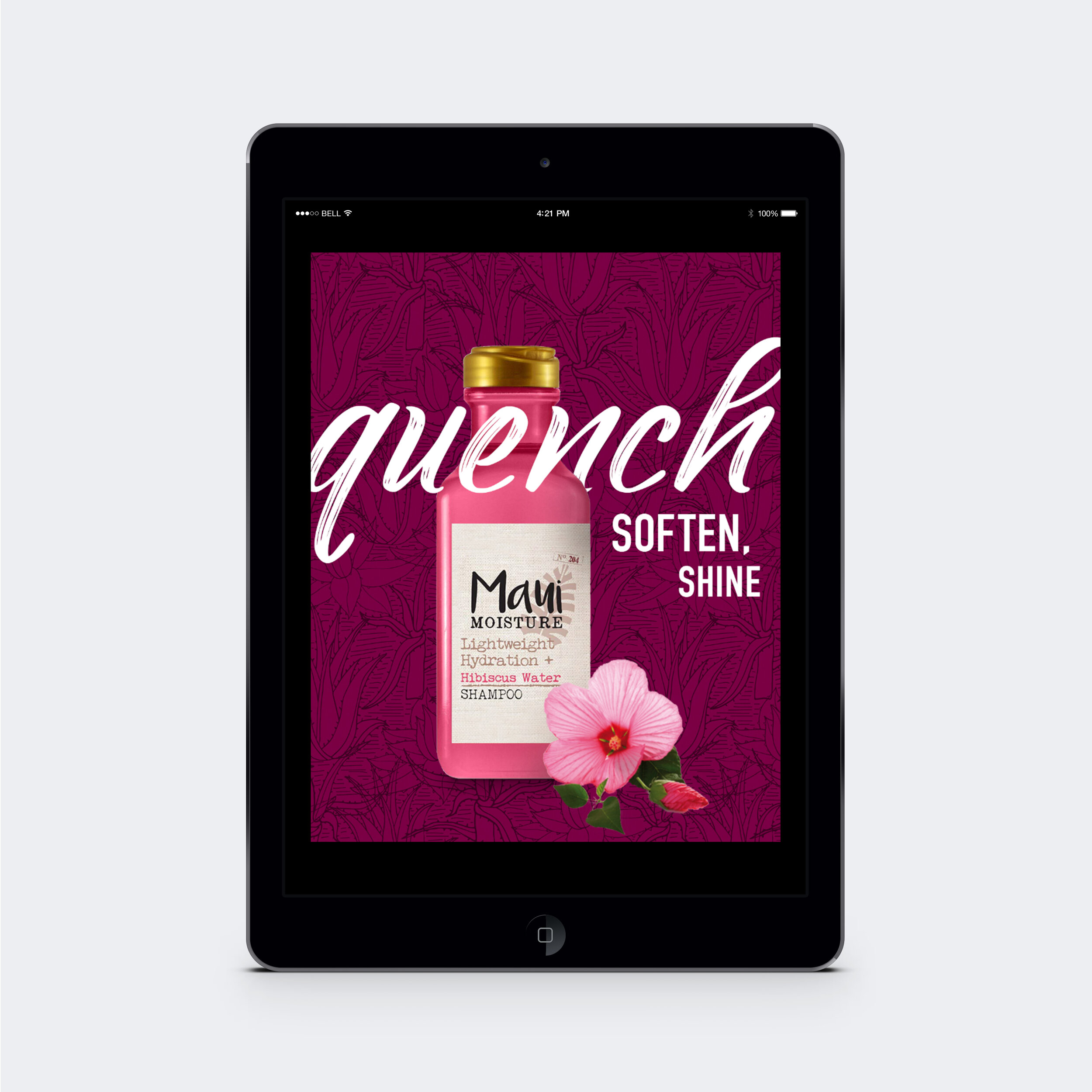
These digital ads were created to promote Maui Moisture products in Target, Walmart and other stores. The brand standards were revisited for this campaign to create better brand recognition. One of the main updates was to simplify the label on the bottle – improving readability. For the ads themselves I highlighted some design elements of the brand that had previously been underutilized. Specifically, the script font was previously used sparingly and only for secondary messaging. Using it in the headline instead created a more dynamic layout, the faux ink strokes in the script playing into the beach-side look. The pattern used in the background was also given more prominence – colors were adjusted to suit each product line. Lastly, the ingredients in each product line needed more attention. Showing real hibiscus flowers or coconut helped to clarify the scent – giving potential customers a better idea of what the products might smell like.
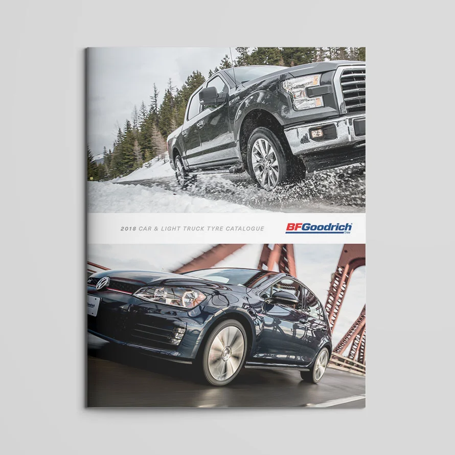
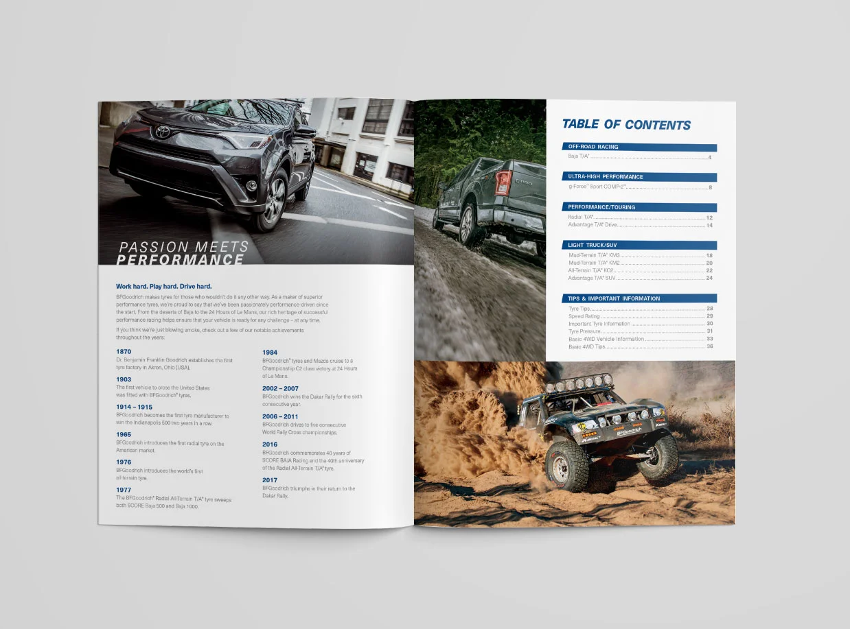
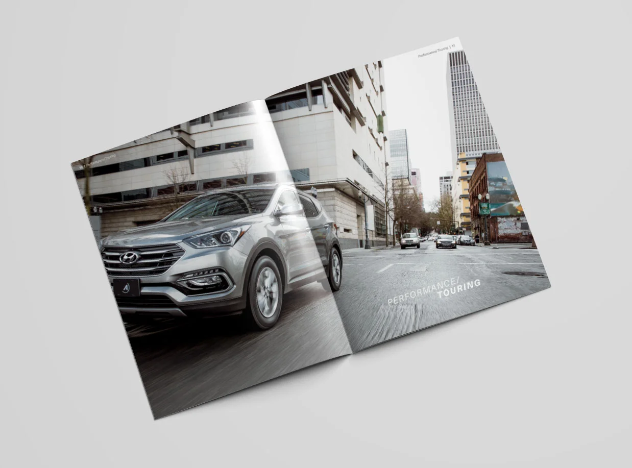
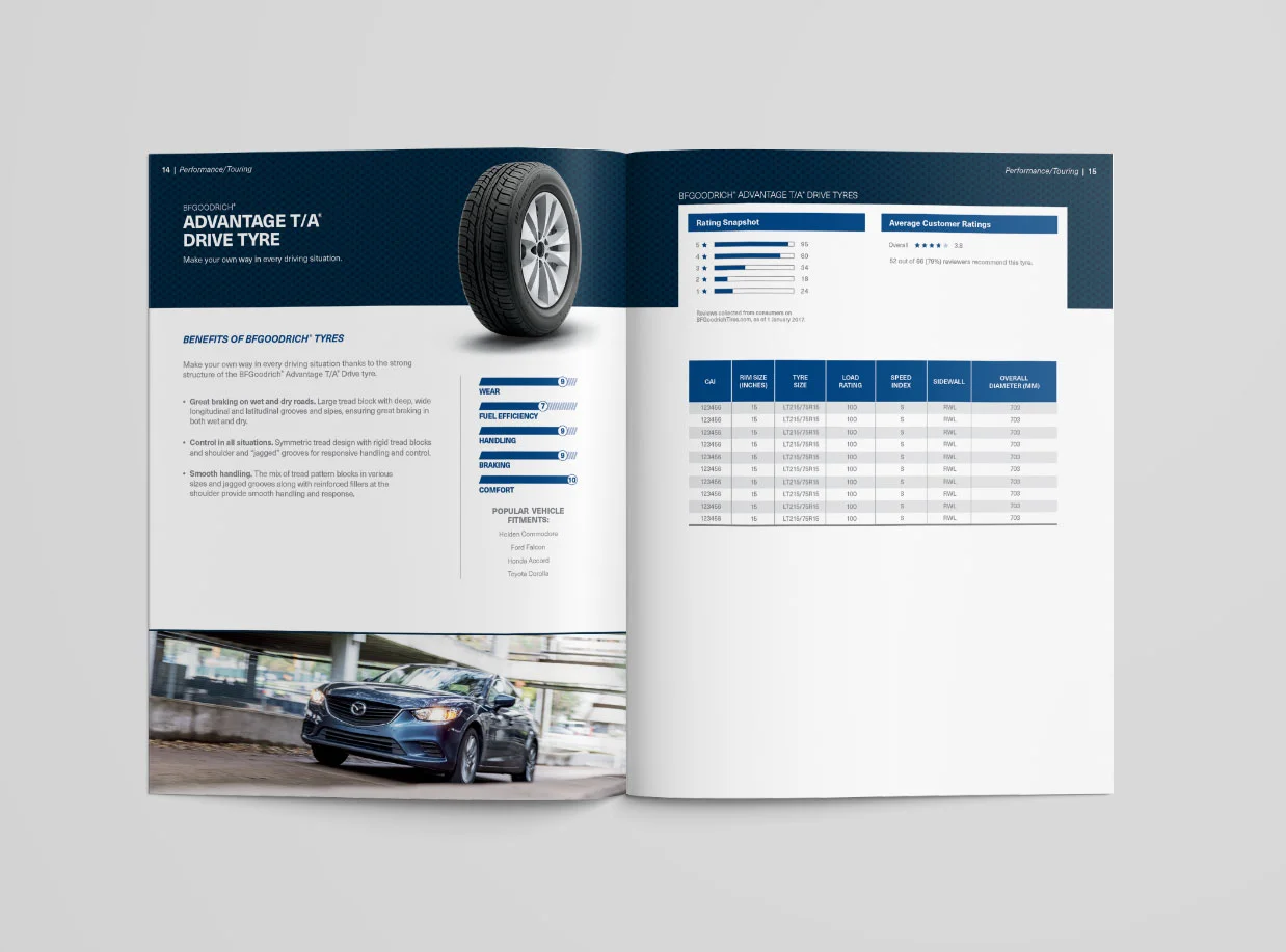
This book was created as a template and shared globally, showcasing all of the tires BFGoodrich offers. In addition to designing the cover and choosing photography, I also finessed the typography and messaging hierarchy.
Associate Creative Director | Michael Shelley
Designer | Jenna Boures
Copywriter | Jake Grothoff
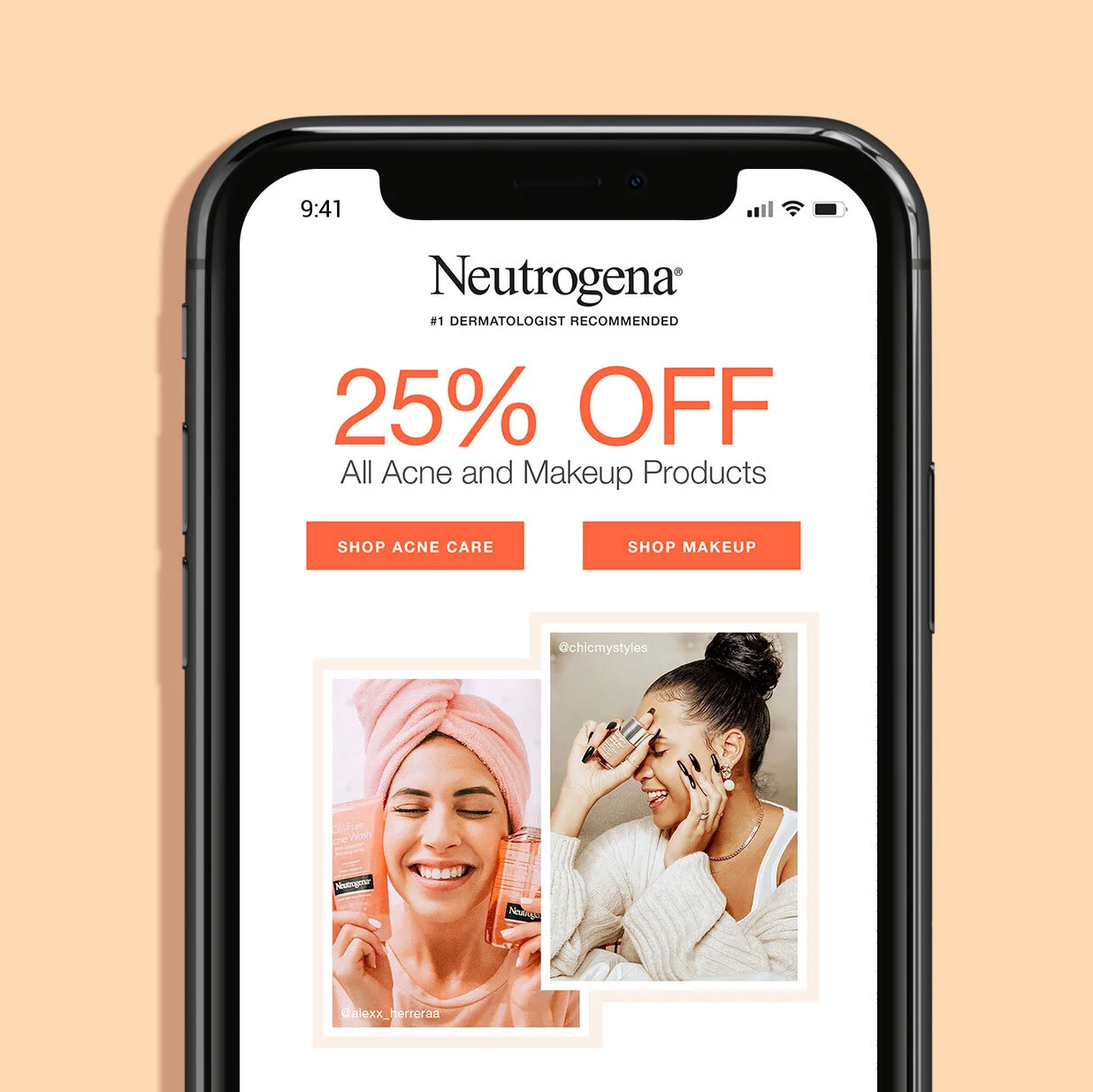
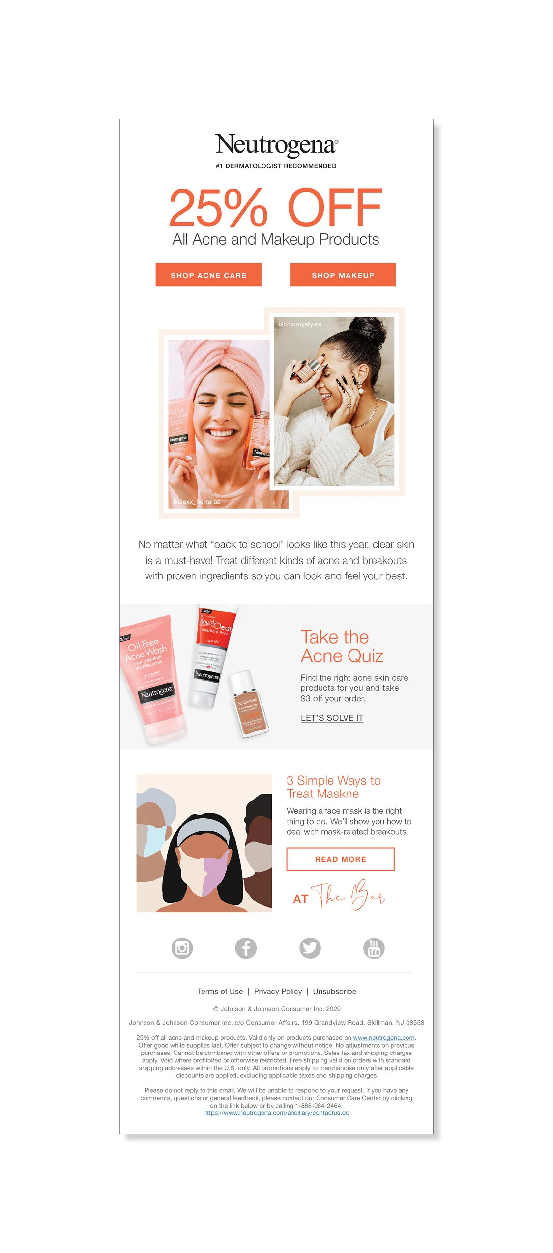
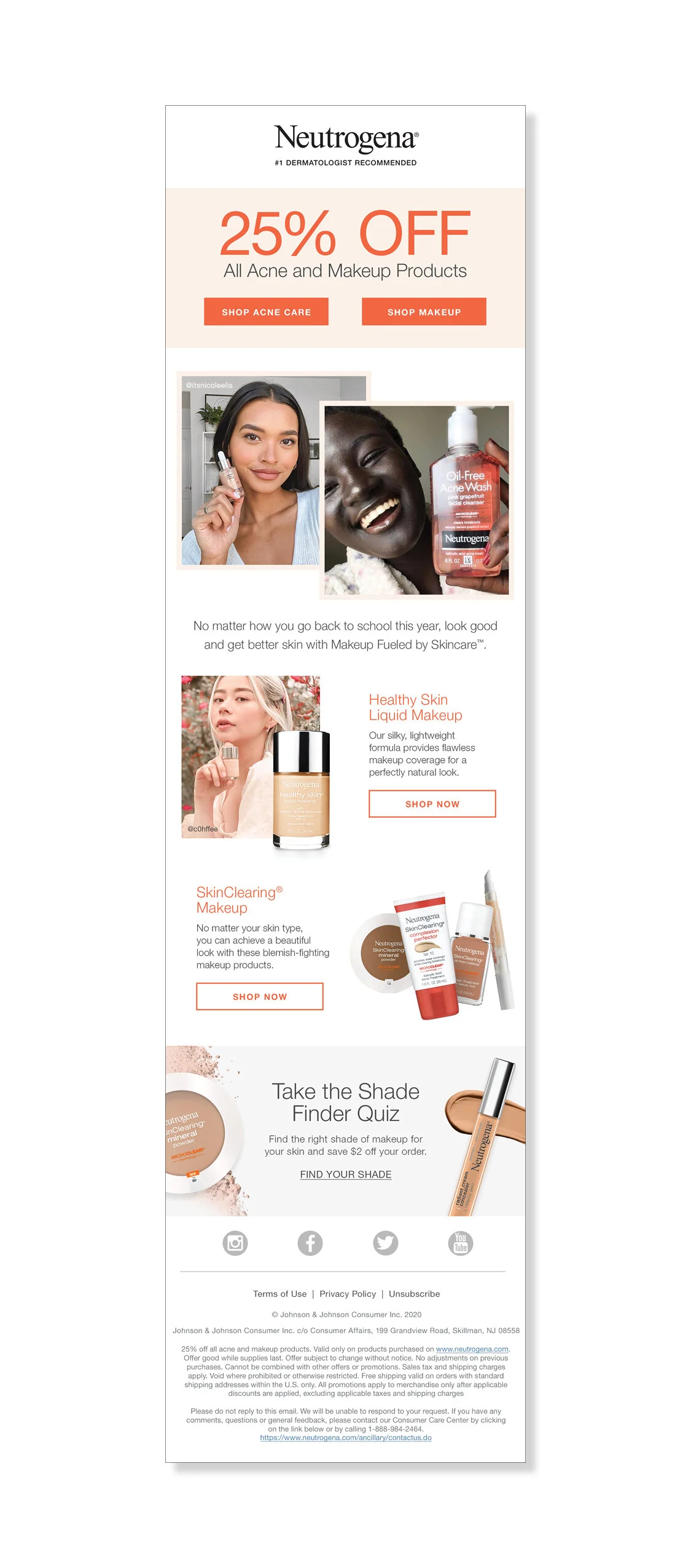
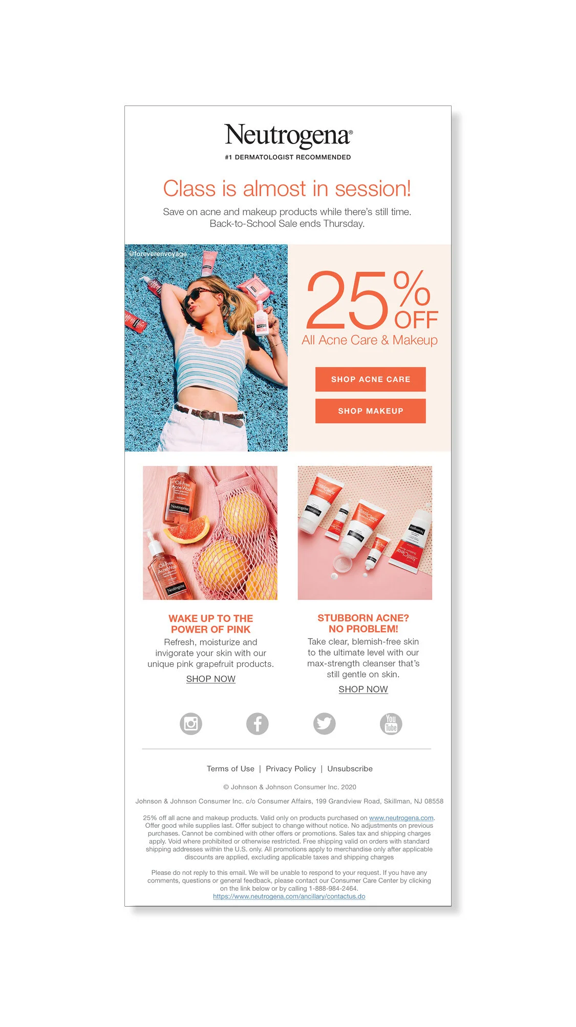
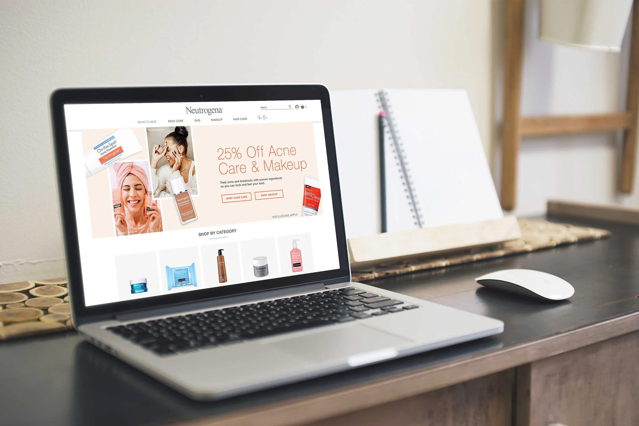
These promotional emails announced the annual back to school sale. The primary messaging in each email focused on the promotion while secondary content focused on popular acne and makeup products. This clean and straightforward design clearly communicates the promotional message while engaging the viewer with lively colors and user-generated content. A banner with the same look and feel was created along with the emails to announce the promotion on Neutrogena.com.
Creative Director | Lisa Braden
Art Director | Erica Cleveland
Designer | Jenna Boures
Copywriter | Sam Nicholson
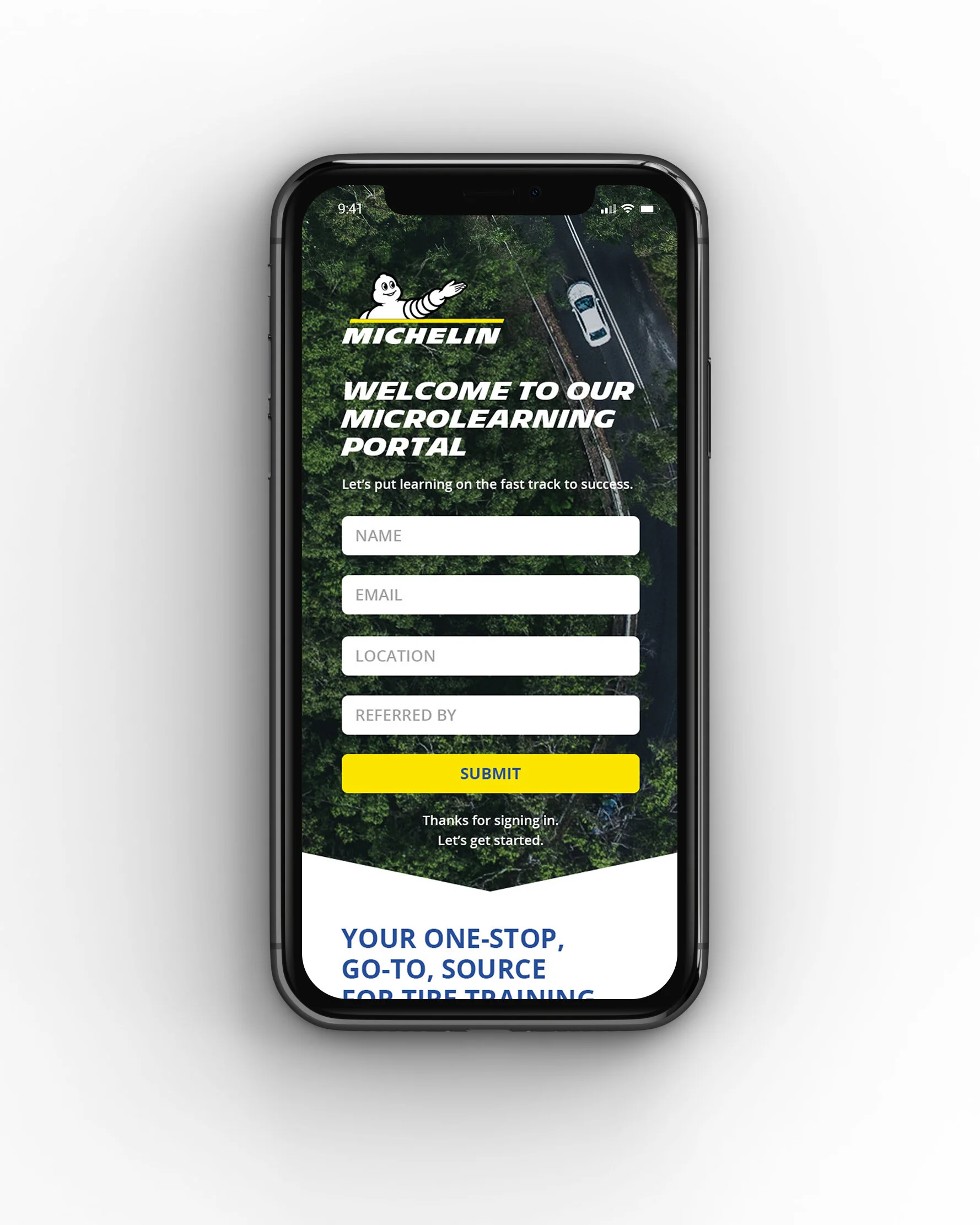
This website wireframe was created to contain all of the Michelin training modules in one accessable place. The layout needed to be responsive and easily read on mobile. My design brings together traditional elements of the brand while keeping the site layout clean, modern and easy to navigate.
Creative Director | Alesha Burgraff
Designer | Jenna Boures
Copywriter | Lee Perlman
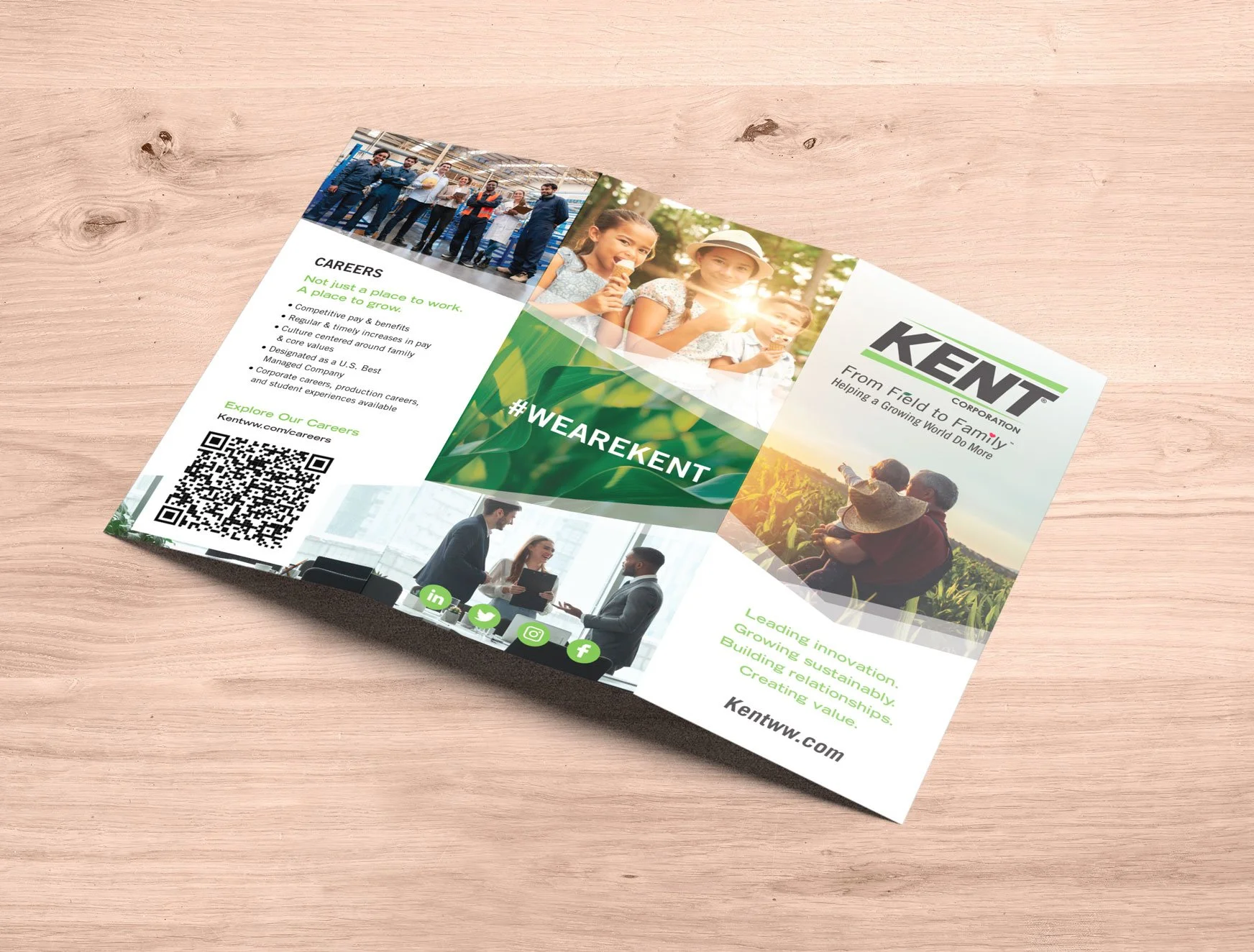
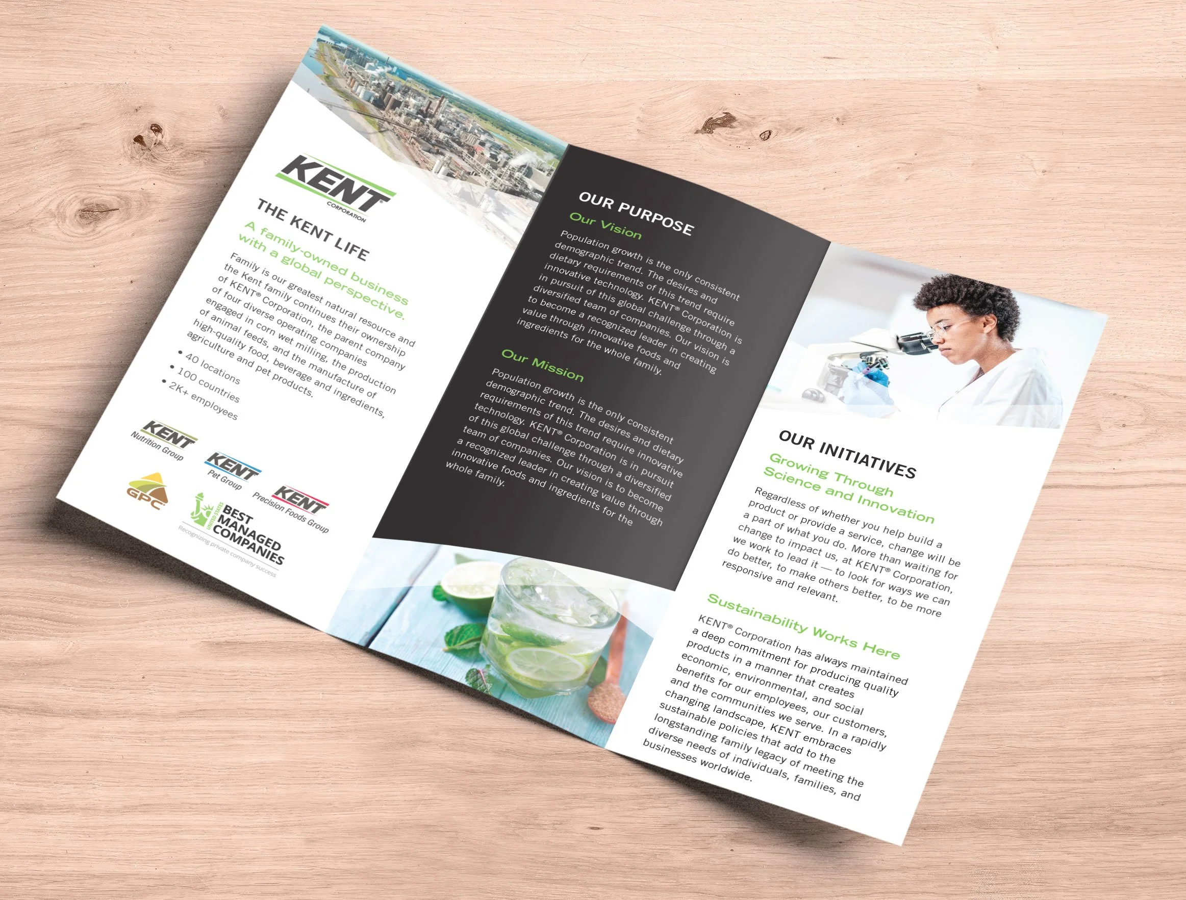
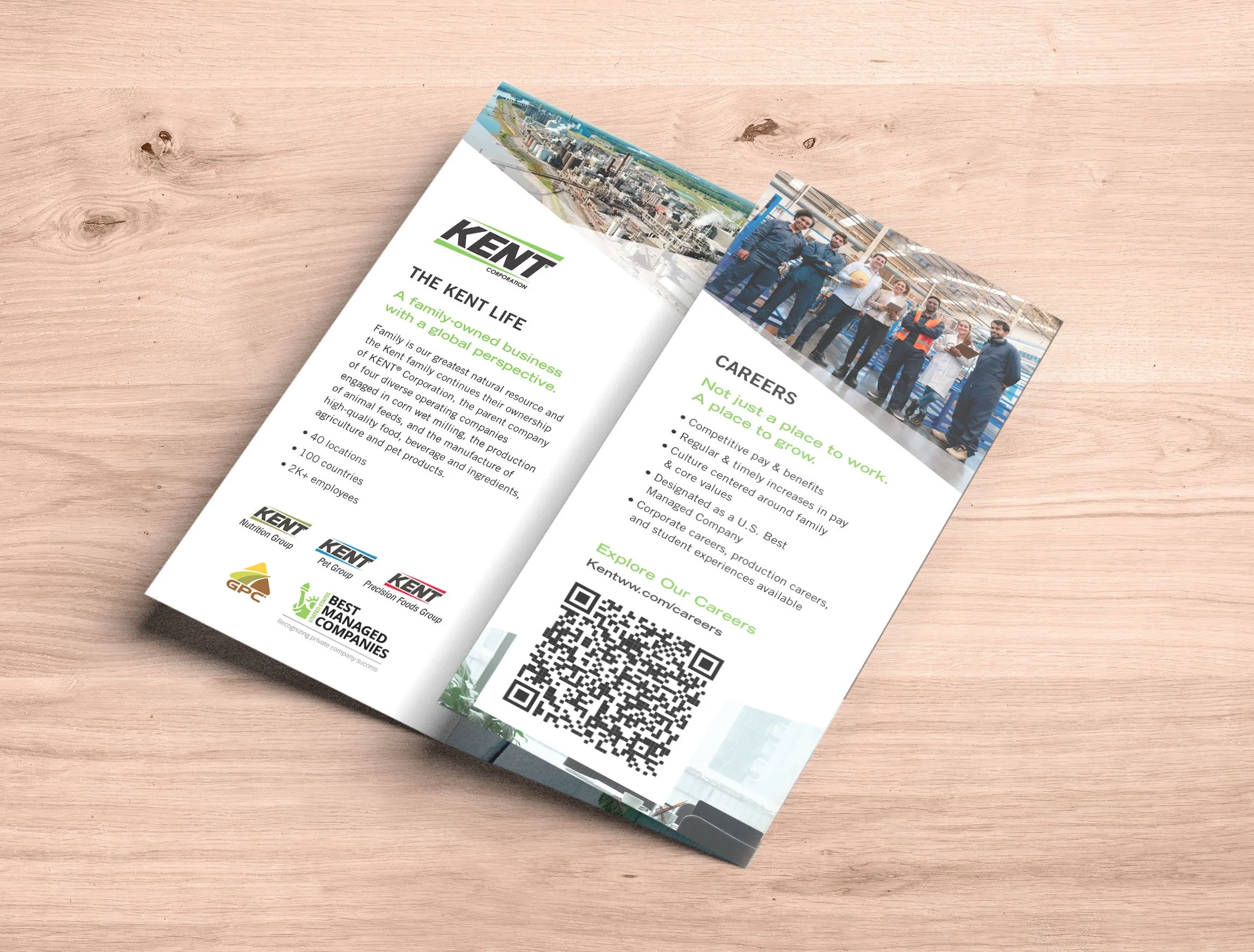
Kent Corporation requested a recruitment brochure that explained their business and subsidiary companies and highlighted employment benefits.
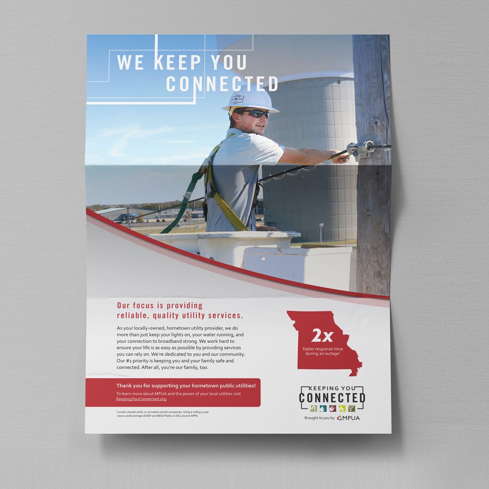
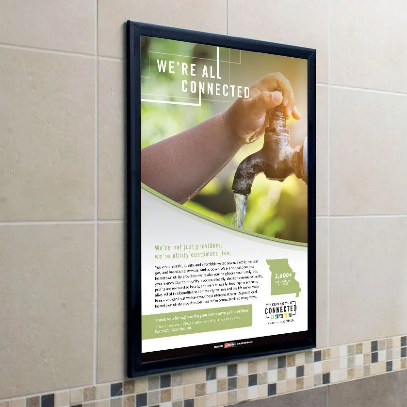
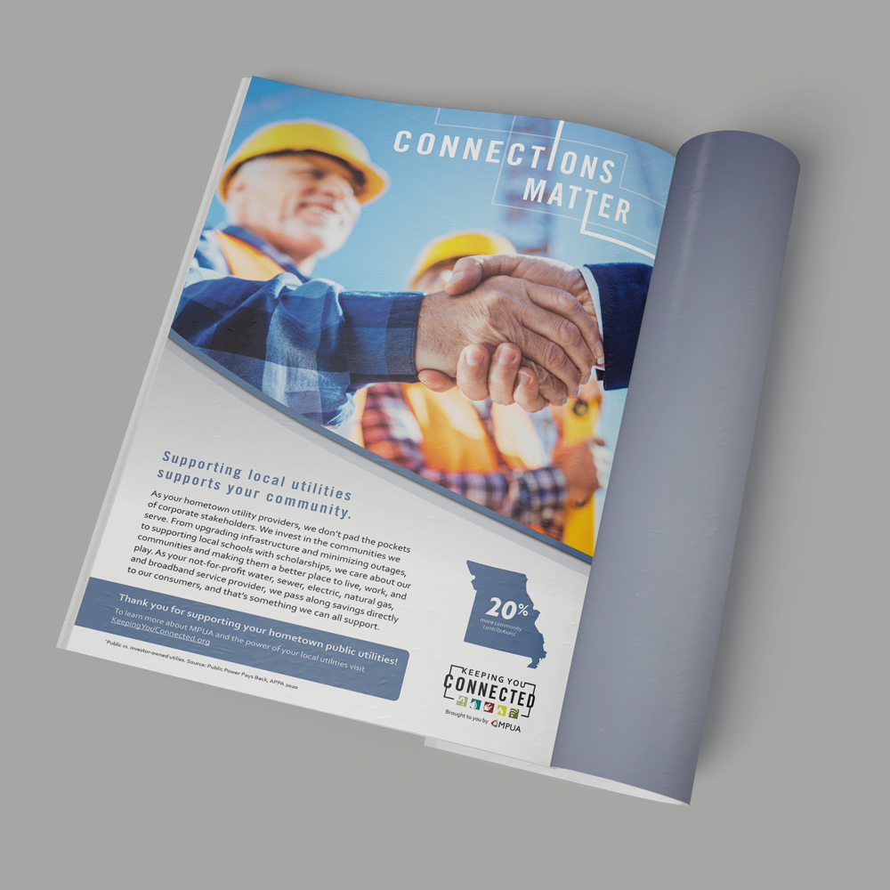
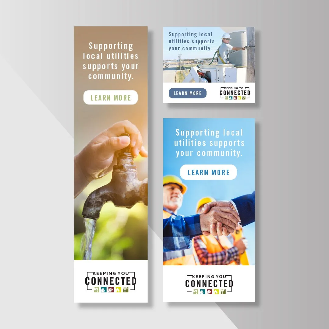
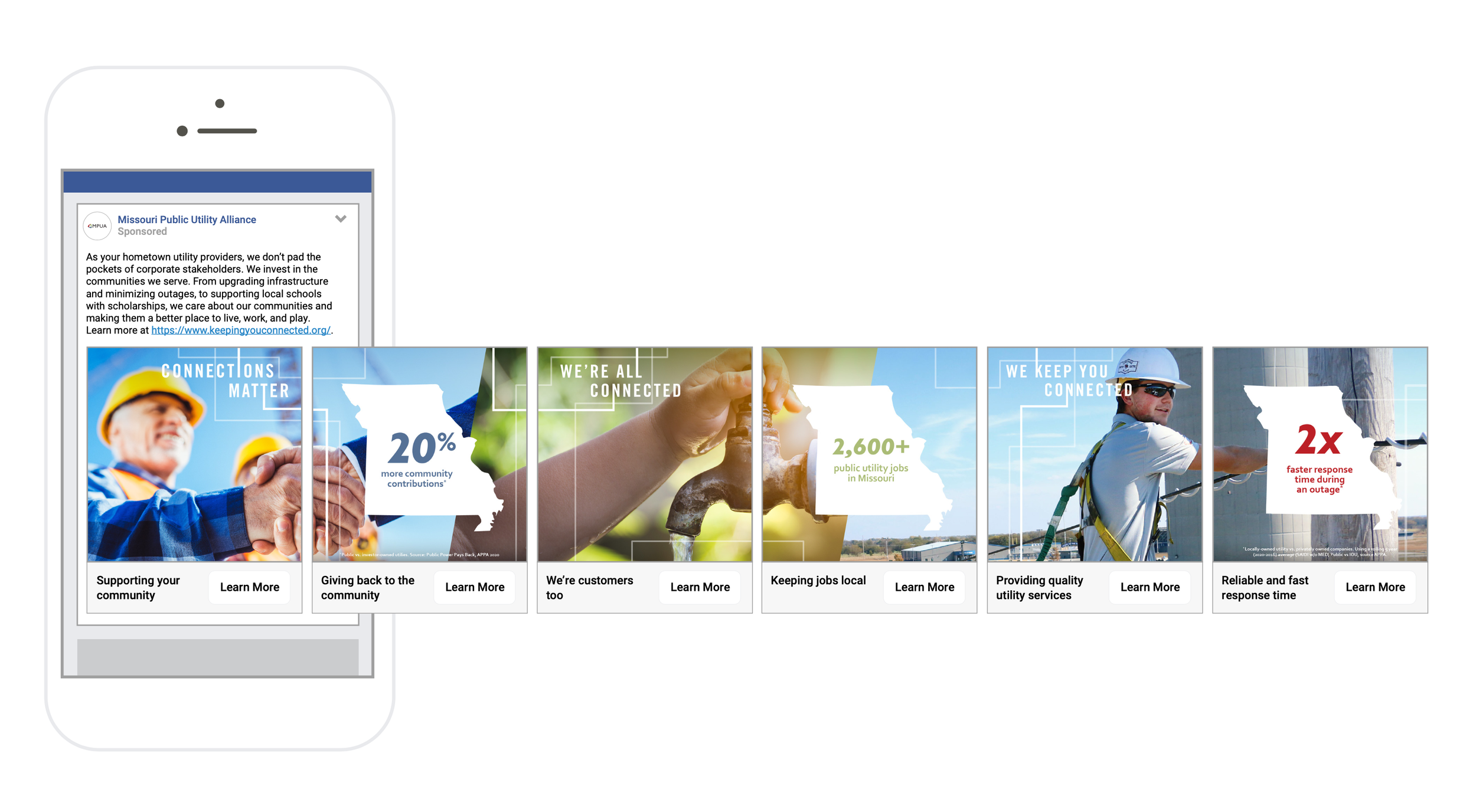
Missouri Public Utility Alliance wanted to raise awareness about the benefits of locally-owned utilities. The “Keeping You Connected” Campaign utilized print and digital media to spread MPUA’s message.
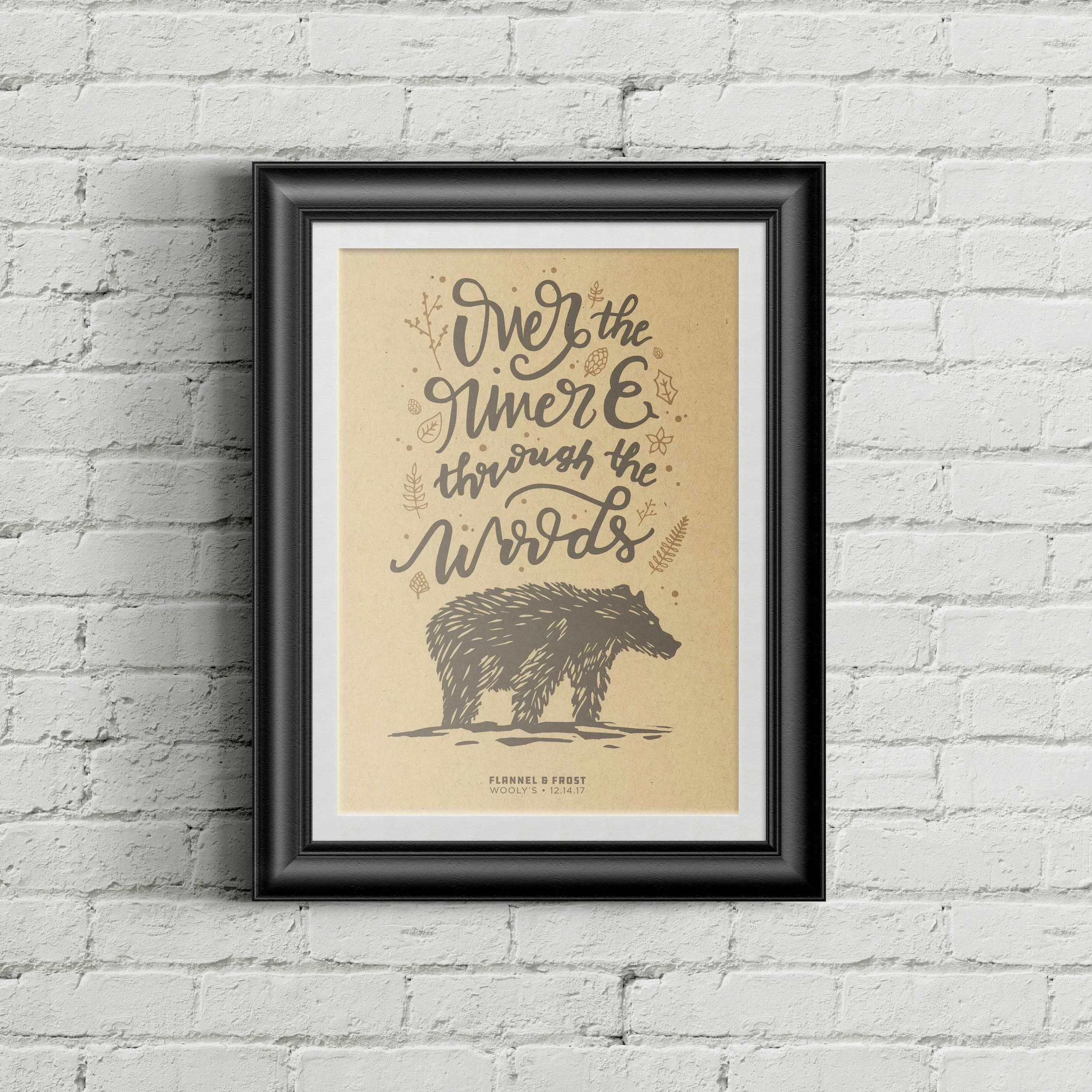
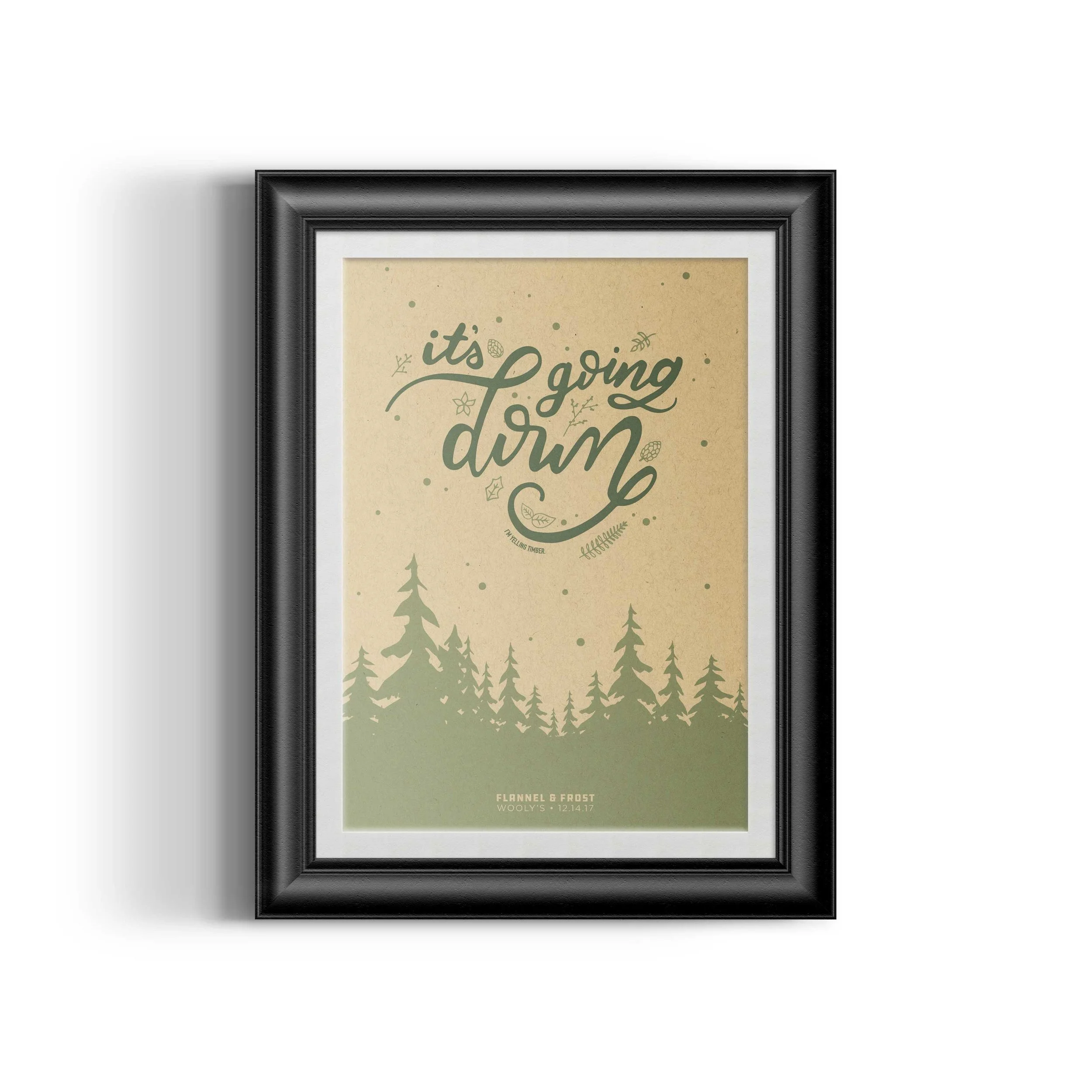
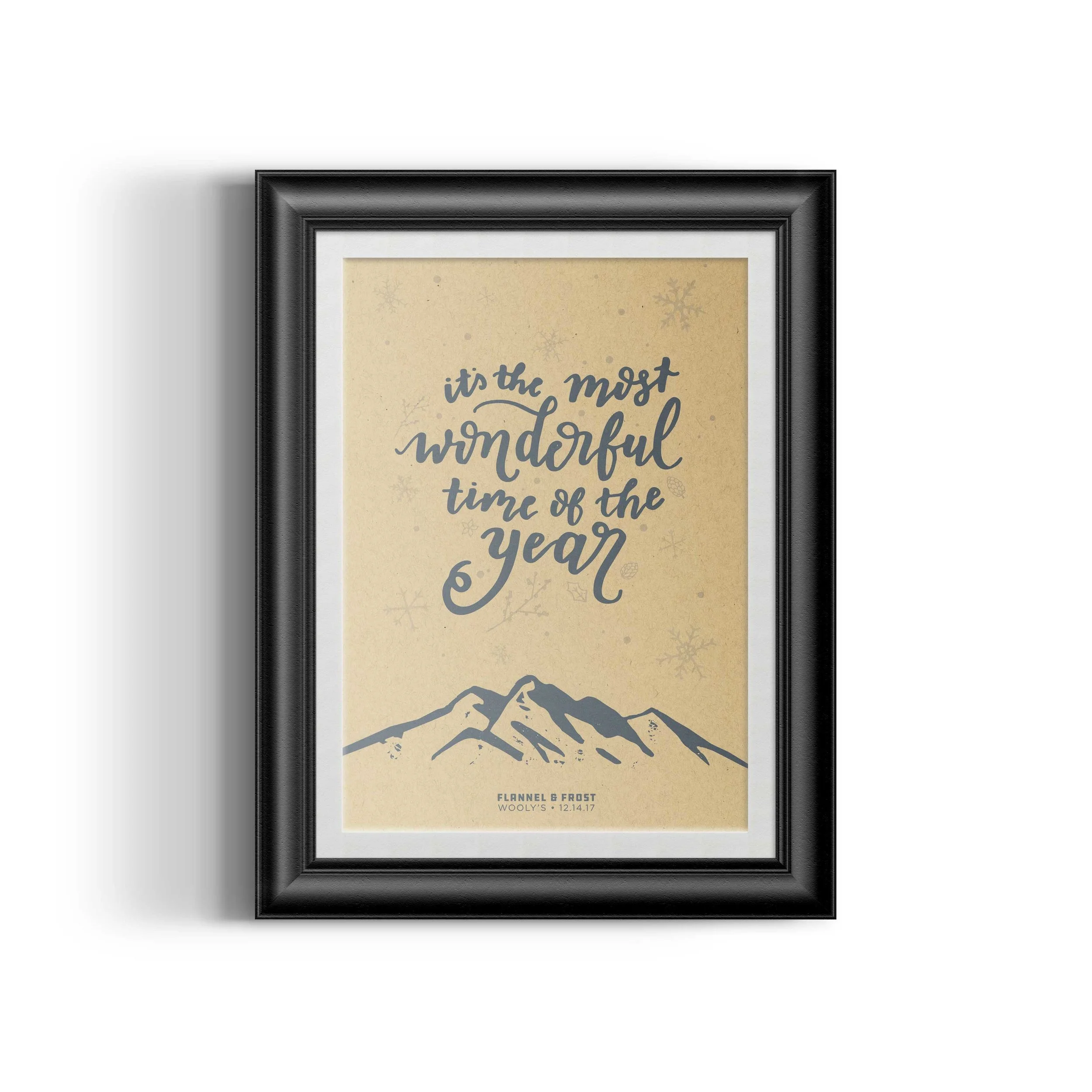
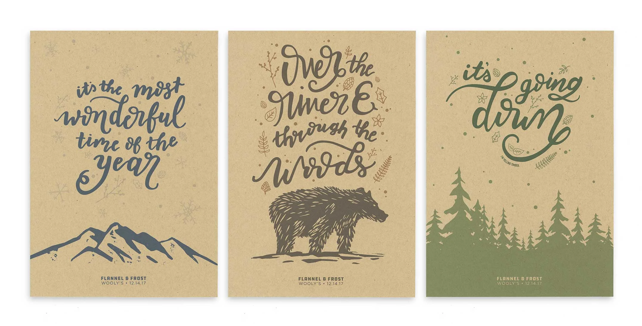
These posters were created for a Flannel & Frost themed holiday party. Quotes from Yuletide songs were drawn to accompany different winter scenes. All graphic elements were hand-drawn or printed from woodcut blocks and digitally manipulated.
Silver Award | Illustration | 2018 American Advertising Awards